Hey there, Excel champs! 👋 This is R. Kr back again with another power-packed Excel tutorial that’ll turn your boring data into a storytelling masterpiece.
What Is a Combo Chart in Excel?
A Combo Chart (short for combination chart) lets you mix different chart types in one graph. It’s perfect for comparing data that have different units, scales, or measurement types — like revenue (in dollars) and growth rate (in percentage).
For example:
- Use a Column Chart for sales volume.
- Use a Line Chart for profit margin over the same period.
The combo chart lets you see both datasets clearly, without confusion or overlapping.
When Should You Use Combo Charts?
✅ Perfect Situations for Combo Charts:
- When comparing two different data series with different units (like dollars vs. percentage).
- When you want to highlight trends (line) alongside quantities (columns).
- When visualizing performance metrics such as actual vs. target or revenue vs. growth.
🚫 Avoid Using Combo Charts When:
- Both data series use the same scale — a simple chart will do.
- There are too many data series — it can quickly become confusing.
Pro Tip 💡: Combo charts shine best when you keep things simple — two or three data series max!
Creating a Combo Chart in Excel (Step-by-Step)
Step 1: Prepare Your Data
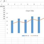
Let’s use a sample dataset for monthly sales and profit percentage.
Month       Sales ($)    Profit (%)
January     45000        12
February    52000        15
March       48000        13
April       60000        18
May         58000        16
June        63000        20
Step 2: Insert a Combo Chart
- Select your entire data range (A1:C7).
- Go to the Insert tab on the Ribbon.
- In the Charts group, click the dropdown arrow under Insert Combo Chart.
- Choose Custom Combo Chart.
Step 3: Choose Chart Types for Each Data Series
In the dialog box that appears:
- Set Sales as a Clustered Column.
- Set Profit (%) as a Line.
- Tick the box Secondary Axis for Profit (%).
Click OK, and boom — your combo chart appears!
Understanding the Secondary Axis
One of the coolest parts of a Combo Chart is the Secondary Axis. It allows you to display a different scale for a second data series, so both large and small values fit nicely in one chart.
In our example:
- Primary Axis (Left): Shows Sales in dollars.
- Secondary Axis (Right): Shows Profit in percentage.
This helps you visually compare metrics that would otherwise be difficult to read on the same scale.
Customizing Your Combo Chart
1. Add Chart and Axis Titles
To make your chart understandable, add descriptive titles:
- Click the chart.
- Use the Chart Elements (+ icon) → Select Axis Titles.
- Edit the titles (e.g., “Monthly Sales ($)” for the left axis, “Profit Percentage (%)” for the right axis).
2. Change Chart Colors
Make your chart more appealing (and readable):
- Select your chart → Chart Tools → Format → Shape Fill.
- Use contrasting colors for the column and line series.
3. Add Data Labels
Right-click on the chart → Add Data Labels. This helps viewers read actual values without hovering.
4. Adjust Line Style
To emphasize trends:
- Click on the line.
- Go to Format Data Series → Line Style.
- Choose a thicker or dashed line for visibility.
Using Formulas with Combo Charts
Before creating charts, you can calculate additional insights using Excel formulas. For instance, you can calculate Profit % using this formula:
= (Profit / Sales) * 100
Store it in a separate column and then use that data in your combo chart to show correlation visually.
Real-World Example: Sales vs. Profit Growth
Imagine you’re a sales manager analyzing how sales and profit move together each month. A Combo Chart can help you quickly spot months where sales were high but profits dipped — maybe due to higher costs or discounts.
Bonus Tip 💬:
You can create a Combo Chart with Three Data Series — for instance, Sales (Column), Profit % (Line), and Target (Line). Just ensure the visuals don’t get too cluttered — clarity always beats complexity!
Best Practices for Using Combo Charts
- Keep it simple: Limit to 2–3 data series.
- Use secondary axis wisely: Only when scales differ significantly.
- Color contrast matters: Make columns and lines distinct.
- Label everything: Your reader shouldn’t have to guess what each axis or line means.
- Don’t overdo 3D effects: They distort readability.
Conclusion
And there you have it — the secret sauce behind Combo Chart in Excel! 🎨 They’re your go-to tool for comparing multiple data trends and relationships on the same canvas.
Whether you’re tracking sales vs. profit, revenue vs. cost, or actual vs. target — Combo Charts make it all look professional and insightful.
So, go ahead and open your Excel sheet — it’s time to mix things up! 💪