Once you master Dynamic Charts in Excel using Named Ranges, your charts will automatically update whenever you add new data — no dragging, resizing, or reselecting required. It’s like giving your charts a little bit of AI magic 🪄 (well, Excel-style AI at least!).
What Is a Dynamic Chart in Excel?
A Dynamic Chart automatically adjusts its data range when new information is added or removed. Instead of manually updating your chart each time you enter new rows, Excel handles it for you.
This feature is especially useful when creating dashboards, reports, or ongoing data logs — where data changes regularly.
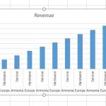
Example: Let’s say you have monthly sales data. Each month, you add a new row for the latest figures. A dynamic chart will update itself instantly without you having to reselect the data range. That’s the magic of automation!
Why Use Named Ranges for Dynamic Charts?
Named Ranges are one of Excel’s most powerful — and underrated — features. They let you assign a name to a cell range (like SalesData), making formulas easier to read and update.
When combined with functions like OFFSET and COUNTA, Named Ranges become truly dynamic — expanding automatically as new data is added.
Here’s a sneak peek at what’s coming:
=OFFSET(Sheet1!$B$2, 0, 0, COUNTA(Sheet1!$B:$B)-1, 1)
This little formula will make your chart come alive — more on that in a moment!
Step-by-Step: Creating a Dynamic Chart Using Named Ranges
Step 1: Prepare Your Data
Let’s say your dataset looks like this:
Month     Sales
Jan       4500
Feb       4800
Mar       5300
Apr       6000
May       6700
Your goal: create a chart that automatically updates when you add June’s data.
Step 2: Define Dynamic Named Ranges
We’ll create two named ranges — one for the months (X-axis) and one for the sales (Y-axis).
👉 For the Months (X-Axis):
- Go to Formulas → Name Manager → New.
- In the Name box, type
MonthRange. - In the Refers to field, enter:
=OFFSET(Sheet1!$A$2, 0, 0, COUNTA(Sheet1!$A:$A)-1, 1)
👉 For the Sales (Y-Axis):
- Again, go to Name Manager → New.
- Type
SalesRange as the name. - In the Refers to box, type:
=OFFSET(Sheet1!$B$2, 0, 0, COUNTA(Sheet1!$B:$B)-1, 1)
Explanation:
OFFSET starts from a reference point (in this case, $A$2 or $B$2).COUNTA counts how many non-empty cells are in the column, determining the range length dynamically.
Pro Tip 💡: If your data has headers, always subtract 1 in the COUNTA function to exclude the header row.
Step 3: Create the Chart
- Select an empty cell (don’t highlight your data yet).
- Go to Insert → Charts → Line Chart (or Column, your choice).
- Right-click the blank chart → Select Data.
- Click Add to create a new data series.
- In the Series Name box, type:
Sales. - In the Series Values box, enter:
=Sheet1!SalesRange
Now click on Edit under Horizontal (Category) Axis Labels and type:
=Sheet1!MonthRange
Click OK, and boom 💥 — you have a fully dynamic chart!
Step 4: Test the Dynamic Behavior
Now for the fun part — add a new month’s data (say, June with 7200 sales) right below May.
Watch your chart magically extend to include the new data point. No manual editing, no dragging chart borders — just smooth, automatic updates.
Congratulations! You’ve just built your first self-updating Excel chart! 🎉
Alternative Method: Using Excel Tables
Okay, confession time — Named Ranges aren’t the only way to do this. If you prefer an even easier approach, turn your dataset into an Excel Table.
- Select your dataset.
- Press Ctrl + T (or go to Insert → Table).
- Make sure “My table has headers” is checked.
Now create a chart from that table — it will automatically update whenever you add new rows. Simple, efficient, and perfect for beginners. But remember, using Named Ranges gives you more flexibility and control in complex dashboards.
Best Practices for Dynamic Charts
- ✅ Always name your ranges clearly — like
MonthRange or SalesRange. - ✅ Keep datasets in columns (not rows) for easier management.
- ✅ Use structured references if you’re working with Excel Tables.
- ✅ Avoid using entire column references (like
A:A) for large datasets — it can slow Excel down.
Pro Tip 🧠: Combine Named Ranges with Dropdown Lists or Dynamic Dashboards to create interactive Excel reports that impress your boss — or your inner perfectionist!
Conclusion
Dynamic charts are like Excel’s secret superpower. With Named Ranges, you can automate chart updates, save tons of time, and make your reports look more professional. Once you understand how OFFSET and COUNTA work together, the possibilities are endless — from dashboards that update in real time to interactive visual reports.
So go ahead — try building one today! The next time your data grows, your chart will be one step ahead of you. 😉