If you’ve ever looked at a financial report or a sales dashboard and wondered, “How did they visualize this so clearly?”, chances are you saw a Waterfall or a Funnel chart.
These two charts are not just visually appealing — they are powerful tools for explaining change and progress.
Excel offers several advanced charts designed for specific storytelling purposes. Among them, Waterfall and Funnel charts stand out because they help answer two very common business questions:
?? Waterfall: How did we move from a starting value to an ending value?
?? Funnel: How does data shrink step by step through a process?
Let’s explore each one in detail.
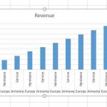
Excel Waterfall Chart Explained
What Is a Waterfall Chart?
A Waterfall Chart shows how a starting value is affected by a series of positive and negative changes, leading to a final result.
It’s commonly used for:
Profit and loss analysis
Budget vs actual comparisons
Cash flow tracking
Year-over-year financial changes
I personally started appreciating Waterfall charts the first time I had to explain why profit dropped despite good sales. Numbers alone confused people — the chart told the story instantly.
Sample Data for a Waterfall Chart
Category
Amount
Opening Balance
50000
Sales Revenue
20000
Operating Expenses
-12000
Marketing Cost
-5000
Taxes
-3000
Closing Balance
50000
How to Create a Waterfall Chart in Excel
Select the data range including headings.
Go to Insert ? Charts ? Waterfall.
Excel automatically generates the Waterfall chart.
Right-click on the first and last bars ? Set as Total.
Best Practices for Waterfall Charts
Use positive values for increases and negative values for decreases.
Always mark starting and ending values as Total.
Use color coding (green for increase, red for decrease).
Limit categories to avoid clutter.
Excel Funnel Chart Explained
What Is a Funnel Chart?
A Funnel Chart shows data values across stages of a process, where values decrease progressively.
Common use cases include:
Sales pipeline analysis
Lead conversion tracking
Recruitment or admission processes
Website conversion funnels
In plain English — it shows where people, money, or opportunities drop off.
Sample Data for a Funnel Chart
Stage
Count
Website Visitors
10000
Leads Generated
4500
Qualified Leads
2300
Proposals Sent
1200
Deals Closed
450
How to Create a Funnel Chart in Excel
Select the data including headers.
Go to Insert ? Charts ? Funnel.
Excel automatically sorts and displays values as a funnel.
Add data labels for clarity.
Best Practices for Funnel Charts
Always sort values from largest to smallest.
Keep stage names short and clear.
Avoid too many stages — 5 to 7 is ideal.
Use consistent colors for professionalism.
Waterfall vs Funnel Chart: Key Differences
Aspect
Waterfall Chart
Funnel Chart
Purpose
Shows cumulative changes
Shows progressive drop-offs
Best For
Financial analysis
Process or pipeline analysis
Data Direction
Positive and negative
Mostly decreasing
Visual Flow
Step-by-step impact
Top to bottom narrowing
Helpful Excel Features to Combine with These Charts
Although formulas aren’t mandatory, they often enhance accuracy:
=SUM(B2:B5)     // Calculate totals before charting
=B3-B2          // Calculate change between stages
=IF(B2<0,"Loss","Gain")
Also consider using:
Conditional Formatting
Data Labels with percentages
Chart Titles and Annotations
Conclusion
Waterfall and Funnel charts transform raw data into clear narratives. One explains how you arrived at a result, the other shows where you lost momentum.
If your goal is to communicate insights rather than just numbers, these two charts deserve a permanent spot in your Excel toolkit.
As always — don’t just read, open Excel and try it. That’s where the real learning happens.
In this tutorial, we’ll explore what a secondary axis is, why you need it, and how to add it step by step in Excel. By the end, you’ll be able to compare data with different scales like a pro.
Sparklines are miniature charts that fit neatly inside a single Excel cell. They display trends or variations in a series of data points — such as sales performance, temperature changes, or stock prices — without taking up much space.
If you’ve ever had to constantly update a chart every time new data was added, you probably know the frustration. But what if I told you there’s a smarter, automatic way? Yep — today we’re diving into Dynamic Charts in Excel using Named Ranges
This website uses cookies to enhance your browsing experience. By continuing to use this site, you consent to the use of cookies. Please review our Privacy Policy for more information on how we handle your data. Cookie Policy
These cookies are essential for the website to function properly.
These cookies help us understand how visitors interact with the website.
These cookies are used to deliver personalized advertisements.