Sparklines are miniature charts that fit neatly inside a single Excel cell. They display trends or variations in a series of data points — such as sales performance, temperature changes, or stock prices — without taking up much space.
Today, we’re diving into one of Excel’s sleekest visualization features — Sparklines. These tiny, cell-sized charts are the unsung heroes of dashboards and reports. They’re like the “emoji” of data — small, expressive, and instantly informative. 😎
Sparklines are miniature charts that fit neatly inside a single Excel cell. They display trends or variations in a series of data points — such as sales performance, temperature changes, or stock prices — without taking up much space.
Introduced in Excel 2010, Sparklines are perfect for spotting patterns, rises, or falls in data directly within your worksheet.
Why Use Sparklines?
They provide quick visual insight without needing a full chart.
They’re compact — ideal for dashboards and compact reports.
They update automatically when your data changes.
They add visual appeal and professionalism to your spreadsheets.
Types of Sparklines in Excel
Excel offers three types of Sparklines, each serving a unique purpose:
Type
Description
Ideal For
Line
Displays trends over time as a line graph.
Sales growth, temperature variation, or stock prices.
Column
Shows data points as vertical bars.
Comparing monthly profits, student scores, or item counts.
Win/Loss
Represents binary data like wins vs. losses or profit vs. loss.
Performance tracking or result comparisons.
How to Create Sparklines in Excel
Step-by-Step Guide
Select the cell (or cells) where you want the Sparkline to appear.
Go to the Insert tab on the Ribbon.
In the Sparklines group, choose the desired type:
Line
Column
Win/Loss
In the dialog box:
Data Range: Select the range containing your data.
Location Range: Select the cell(s) where you want the Sparklines displayed.
Click OK — and voilà, your tiny chart appears!
Example:
Let’s say you have sales data for six months:
Month
Sales ($)
Jan
2500
Feb
3000
Mar
2800
Apr
3500
May
4000
Jun
3800
Select the sales data (B2:B7), go to Insert → Sparklines → Line, and choose the cell (say C2) for placement. You’ll instantly see a mini line chart showing the upward sales trend.
Customizing Sparklines
Once you’ve created Sparklines, you can make them pop visually. When a Sparkline is selected, the Sparkline Tools → Design tab appears on the Ribbon.
1. Change Sparkline Type
Switch between Line, Column, or Win/Loss with one click from the Design tab.
2. Highlight Key Points
Markers: Show points for each data value.
High Point / Low Point: Highlight peaks and dips automatically.
First Point / Last Point: Useful for showing starting and ending values.
3. Customize Style and Color
From the Style group, pick preset colors or define custom ones for both the line and marker points. For example, make negative values red and positive ones green for better readability.
4. Adjust Axis and Grouping
In the Group section of the Design tab, you can:
Group multiple Sparklines for synchronized formatting.
Set uniform axis limits for fair comparisons.
How to Delete Sparklines
If you ever need to remove them (without deleting your data):
Select the Sparkline cell(s).
Go to Design → Clear → Clear Selected Sparklines.
Best Practices for Using Sparklines
Keep it simple: Don’t overload with markers or styles — clarity wins.
Use consistent scales: For comparing trends, make sure all Sparklines share the same axis range.
Label your data: Even though Sparklines are small, labels help context.
Combine with Conditional Formatting: A colorful data table + Sparklines = Excel perfection.
Pro Example: Monthly Profit Trends Dashboard
Imagine you manage three branches — North, South, and East — and want to compare profit trends:
Month
North
South
East
Trend
Jan
2000
1800
2200
(Sparkline here)
Feb
2100
2000
2300
Mar
2500
2400
2600
Apr
2700
2600
2800
May
3000
2800
3100
Jun
3200
3000
3300
Create a Line Sparkline in the “Trend” column using all three branch values — and boom! You now have a compact trend visualization for your profit data.
Conclusion
Sparklines are like your data’s heartbeat monitor — quick, visual, and incredibly effective. Whether you’re preparing an executive dashboard or analyzing project progress, these micro charts make data storytelling powerful and space-efficient.
So, next time you think, “I wish I could show this trend neatly,” remember: Don’t make a big chart — make a Sparkline! ⚡📊
If you’ve ever looked at a financial report or a sales dashboard and wondered, “How did they visualize this so clearly?”, chances are you saw a Waterfall or a Funnel chart.
These two charts are not just visually appealing — they are powerful tools for explaining change and progress.
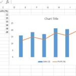
In this tutorial, we’ll explore what a secondary axis is, why you need it, and how to add it step by step in Excel. By the end, you’ll be able to compare data with different scales like a pro.
If you’ve ever had to constantly update a chart every time new data was added, you probably know the frustration. But what if I told you there’s a smarter, automatic way? Yep — today we’re diving into Dynamic Charts in Excel using Named Ranges
This website uses cookies to enhance your browsing experience. By continuing to use this site, you consent to the use of cookies. Please review our Privacy Policy for more information on how we handle your data. Cookie Policy
These cookies are essential for the website to function properly.
These cookies help us understand how visitors interact with the website.
These cookies are used to deliver personalized advertisements.