In this tutorial, we’ll explore what a secondary axis is, why you need it, and how to add it step by step in Excel. By the end, you’ll be able to compare data with different scales like a pro.
A secondary axis is an additional vertical (or horizontal) axis added to a chart. It allows you to plot two different data series that use different value ranges.
For example:
Sales values in thousands
Profit percentage from 0% to 100%
Plotting both on the same axis would squash one line flat. The secondary axis solves this problem by giving each data series its own scale.
When Should You Use a Secondary Axis?
Best Use Cases
Comparing currency values and percentages
Showing sales vs growth rate
Displaying quantity vs price
Tracking revenue and profit margin together
When NOT to Use It
If both data series use similar value ranges
If it makes the chart confusing for beginners
If a simple column or line chart works just fine
Rule of thumb: Use a secondary axis only when it improves clarity, not complexity.
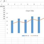
Sample Data for Secondary Axis Chart
Let’s use a simple sales and profit example.
Month
Sales (₹)
Profit %
January
120000
18%
February
150000
22%
March
170000
25%
April
140000
20%
Here, Sales values are large numbers, while Profit % is a small percentage range—perfect for a secondary axis.
How to Add a Secondary Axis in Excel (Method 1: Chart Options)
Step-by-Step Instructions
Select the entire data range.
Go to Insert → Charts → Line or Column Chart.
Create a chart (for example, a column chart).
Click on the data series you want on the secondary axis (Profit %).
Right-click → Format Data Series.
Under Series Options, select Secondary Axis.
Instantly, Excel adds a second vertical axis on the right side of the chart.
Method 2: Using a Combo Chart (Recommended)
This is my favorite approach because it gives you full control.
Steps to Create a Combo Chart with Secondary Axis
Select your data.
Go to Insert → Combo Chart → Custom Combo Chart.
Set Sales as Clustered Column.
Set Profit % as Line.
Check the box for Secondary Axis next to Profit %.
Click OK.
You now have a clean, professional-looking chart showing both values clearly.
Formatting the Secondary Axis for Clarity
Change Axis Scale
Right-click the secondary axis → Format Axis → adjust minimum, maximum, and major units.
Format as Percentage
Right-click Axis → Format Axis → Number → Percentage
Add Axis Titles
Always label both axes:
Primary Axis: Sales (₹)
Secondary Axis: Profit (%)
This avoids the classic “What am I looking at?” moment for your audience.
Common Mistakes to Avoid
Using two axes without clear labels
Mixing unrelated data series
Overloading the chart with colors and effects
Forgetting to explain the chart in reports or presentations
Pro tip: If you have to explain the chart for more than 30 seconds, simplify it.
Real-World Example
I once used a secondary axis chart to show website traffic and conversion rate in a client report. Traffic was in thousands, conversions in percentages. Without a secondary axis, the conversion line was invisible. With it? Crystal clear—and the client loved it.
Conclusion
Adding a secondary axis in Excel is not just a charting trick—it’s a storytelling tool. It helps you compare different metrics without sacrificing clarity.
Practice with your own data, experiment with combo charts, and always ask: Does this make my message clearer?
If you’ve ever looked at a financial report or a sales dashboard and wondered, “How did they visualize this so clearly?”, chances are you saw a Waterfall or a Funnel chart.
These two charts are not just visually appealing — they are powerful tools for explaining change and progress.
Sparklines are miniature charts that fit neatly inside a single Excel cell. They display trends or variations in a series of data points — such as sales performance, temperature changes, or stock prices — without taking up much space.
If you’ve ever had to constantly update a chart every time new data was added, you probably know the frustration. But what if I told you there’s a smarter, automatic way? Yep — today we’re diving into Dynamic Charts in Excel using Named Ranges
This website uses cookies to enhance your browsing experience. By continuing to use this site, you consent to the use of cookies. Please review our Privacy Policy for more information on how we handle your data. Cookie Policy
These cookies are essential for the website to function properly.
These cookies help us understand how visitors interact with the website.
These cookies are used to deliver personalized advertisements.