Why Charts Matter in Excel
Let’s be real — nobody wants to stare at hundreds of cells filled with numbers. That’s where charts step in. Charts turn boring data into visual insights, making trends, comparisons, and patterns instantly clear.
In Excel, charts aren’t just decoration — they’re decision-making tools. Whether you’re tracking monthly sales, student grades, or social media engagement, a well-designed chart can tell your story beautifully.
Before You Start: Prepare Your Data
Before creating any chart, you must organize your data properly. Each chart type in Excel loves clean, structured data. For example:
    Month     | Sales
    -------------------
    January   | 2500
    February  | 3400
    March     | 4100
    April     | 3800
    May       | 5000
Make sure your headers (like “Month” and “Sales”) are clearly labeled — Excel uses them for chart titles and legends.
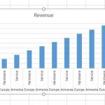
1. Creating a Bar Chart in Excel
What Is a Bar Chart?
A Bar Chart represents data with horizontal bars. It’s perfect when you want to compare categories side by side — for example, sales across regions or performance across departments.
How to Create a Bar Chart (Step-by-Step)
- Select your data range (for example,
A1:B6). - Go to the Insert tab on the Ribbon.
- Click on the Insert Column or Bar Chart icon.
- Under the “2-D Bar” section, choose Clustered Bar.
And boom ?? — your first bar chart appears!
Customizing Your Bar Chart
- Change Chart Title: Double-click the title and rename it (e.g., “Monthly Sales Comparison”).
- Add Data Labels: Click your chart ? Chart Elements (+) ? Check Data Labels.
- Change Colors: Go to Chart Design ? Change Colors for a visual refresh.
Pro Tip: Use bar charts when your category names are long — horizontal space makes labels easier to read.
2. Creating a Column Chart in Excel
What Is a Column Chart?
A Column Chart is like a bar chart turned upright — it uses vertical bars to compare data. Column charts are ideal for showing trends over time (like months or quarters).
Steps to Create a Column Chart
- Select your data range (e.g.,
A1:B6). - Go to Insert ? Column or Bar Chart.
- Select Clustered Column under the “2-D Column” category.
Congratulations — your column chart just went live!
Customizing Your Column Chart
- Chart Title: Rename it to “Sales Growth by Month”.
- Axis Titles: Add labels for clarity — for example, “Month” on the X-axis and “Sales ($)” on the Y-axis.
- Gridlines: Keep light gridlines for better readability.
Pro Tip: Use column charts to highlight changes over time. The upward and downward bars make trends easy to spot.
3. Creating a Line Chart in Excel
What Is a Line Chart?
A Line Chart connects data points with lines — perfect for showing trends, progress, or changes over time. Think of it as your “performance story” in one smooth curve.
How to Create a Line Chart
- Select your data (for instance,
A1:B6). - Go to the Insert tab.
- Click Insert Line or Area Chart.
- Choose Line under the “2-D Line” section.
Customizing Your Line Chart
- Change Line Style: Double-click the line ? Format Data Series ? Line Style to adjust thickness or color.
- Add Markers: Highlight each data point with circular markers for better visibility.
- Legend: Ensure your legend clearly describes each line (especially if you compare multiple datasets).
Pro Tip: Line charts shine when showing continuous data — like stock prices, temperature changes, or website traffic over time.
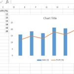
Bonus: Combining Chart Types
Want to impress your boss (or your YouTube audience)? Combine chart types! For example, you can overlay a line chart (to show trends) on a column chart (to show totals).
How to Create a Combo Chart
- Select your dataset with multiple columns.
- Go to Insert ? Combo Chart ? Custom Combo Chart.
- Choose Column for one series and Line for another.
- Click OK — now you have a dual insight chart!
Pro Tip: Use combo charts sparingly. Too many chart types in one space can confuse viewers — not impress them.
Polishing Your Charts Like a Pro
Creating charts is one thing; making them stand out is another. Here’s how to make yours presentation-ready:
- ??? Titles Matter: Always include descriptive titles that tell a story.
- ?? Color Coordination: Use consistent color themes across your charts.
- ?? Clean Layout: Remove unnecessary gridlines or 3D effects — simplicity wins.
- ?? Data Labels: Add labels for clarity without overcrowding the chart.
Conclusion
And that’s a wrap! You’ve officially learned how to create Bar, Column, and Line charts in Excel. Whether you’re reporting sales, tracking progress, or presenting research — charts make your data visually powerful and easy to digest.
Here’s your next mission: open Excel, grab some data, and try making all three chart types today. The more you play, the faster you’ll master Excel’s visualization game.
As I always say — data tells a story, but charts make people listen.