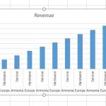
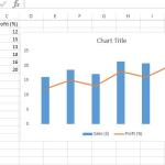
Are you struggling to present your data in a clear and professional way? In this video, we’ll guide you step by step on how to create charts and graphs in Microsoft Excel. You’ll learn how to make Pie Charts, Bar Charts, Column Charts, and Line Charts easily, even if you are a beginner. With practical examples, we’ll show you how to turn raw data into visual insights that are easy to understand and perfect for reports, presentations, or assignments.
Whether you are a student, business professional, or data analyst, mastering Excel charts and graphs can significantly improve your productivity. This tutorial covers everything from inserting a chart, customizing styles, formatting axes, adding titles, legends, and labels, to making your charts more visually appealing. By the end of this lesson, you’ll be confident in choosing the right chart type for your data and presenting it in the most effective way.
If you want to improve your Excel skills and learn practical tips for better data visualization in Excel, this video is for you. Don’t forget to subscribe for more Excel tutorials and productivity hacks!
In this video, you’ll discover how to use Conditional Formatting in Excel to make your data more meaningful and visually appealing. We’ll walk through step-by-step examples on highlighting cells based on values etc. Perfect for beginners and intermediate Excel users, this tutorial will help you quickly identify trends, spot errors, and analyze data patterns with ease.
This website uses cookies to enhance your browsing experience. By continuing to use this site, you consent to the use of cookies. Please review our Privacy Policy for more information on how we handle your data. Cookie Policy
These cookies are essential for the website to function properly.
These cookies help us understand how visitors interact with the website.
These cookies are used to deliver personalized advertisements.