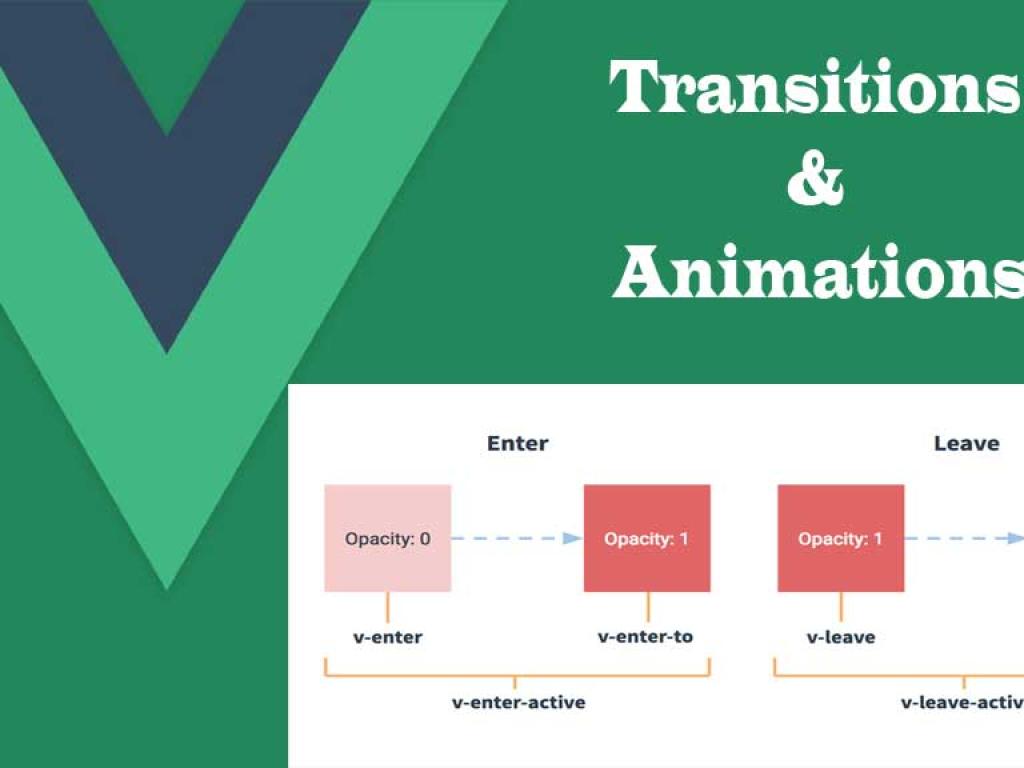
Table of contents [Show]
- Why Animations Matter (and why you shouldn't overdo them)
- Quick recap: Vue’s animation primitives
- Project structure for the animated dashboard
- Global setup (main.js)
- App shell (App.vue)
- Animated Sidebar (Sidebar.vue)
- Statistic Card with subtle entrance (StatCard.vue)
- Animated List with reorder (AnimatedList.vue)
- Animated Modal (Modal.vue) — full example
- Dashboard View (Dashboard.vue) — complete practical example
- Performance considerations & best practices
- Tips for combining CSS & JavaScript animations
- Common pitfalls and troubleshooting
- Complete copy-paste checklist
- Final thoughts — craft, don't clutter
Why Animations Matter (and why you shouldn't overdo them)
Motion is more than eye candy. Thoughtful animations:
- Guide attention and explain spatial relationships (where content came from / where it goes).
- Improve perceived performance — a subtle transition makes slow loads feel faster.
- Provide feedback for actions (button pressed, card removed, item added).
But beware: too many flashy effects, inconsistent durations, or poor performance ruin UX. The rule of thumb I use: if it helps the user understand the UI change — animate it; otherwise keep it still.
Quick recap: Vue’s animation primitives
Vue provides built-in components to hook into the DOM lifecycle and apply animation classes or JS hooks:
<transition>— single element or component enter/leave transitions.<transition-group>— animated lists, reorders, add/remove.- Transition CSS classes (
-enter-from,-enter-active,-enter-to,-leave-from, ...). - JS hooks on
<transition>(before-enter,enter,leave) for fine control or external libs.
We’ll use all of these in the example dashboard below.
Project structure for the animated dashboard
We'll provide full single-file component (SFC) examples—drop these into a Vue 3 + Vite app. The important files we'll create:
src/main.jssrc/App.vuesrc/components/Sidebar.vuesrc/components/StatCard.vuesrc/components/AnimatedList.vuesrc/components/Modal.vuesrc/views/Dashboard.vue- optional
src/assetsstyles
Each component will show accessible HTML, CSS transitions, and optionally JS hooks for nuanced motion.
Global setup (main.js)
Create the Vue app and mount it. Nothing fancy here; main work is in components.
// src/main.js
import { createApp } from 'vue'
import App from './App.vue'
import './assets/global.css' // global styles (optional)

createApp(App).mount('#app')
Now dive into UI components.
App shell (App.vue)
App.vue wires the dashboard view. We'll keep it simple and focus on animations inside components.
<template>
  <div id="app">
    <Dashboard />
  </div>
</template>

<script setup>
import Dashboard from './views/Dashboard.vue'
</script>

<style>
#app { min-height:100vh; background:#f4f6f8; }
</style>
Sidebar slides in/out from the left. We'll use <transition> with CSS transforms for GPU-accelerated motion (transform over left/top where possible).
<!-- src/components/Sidebar.vue -->
<template>
 <transition name="slide-left">
  <aside v-if="open" role="complementary" aria-label="Sidebar">
   <div >
    <h3>Navigation</h3>
    <nav>
     <ul>
      <li><a href="#">Overview</a></li>
      <li><a href="#">Reports</a></li>
      <li><a href="#">Settings</a></li>
     </ul>
    </nav>
   </div>
  </aside>
 </transition>
</template>

<script setup>
defineProps({
 open: { type: Boolean, required: true }
});
</script>

<style scoped>
.sidebar {
 position: fixed;
 left:0;
 top:0;
 height:100vh;
 width:260px;
 background:linear-gradient(180deg,#ffffff,#f8fafc);
 box-shadow: 2px 0 12px rgba(6,9,12,0.08);
 z-index: 40;
 padding: 18px;
 box-sizing: border-box;
}
.sidebar-inner { max-width:220px; }
.sidebar h3 { margin-top:0; }

/* slide-left transition */
.slide-left-enter-active, .slide-left-leave-active {
 transition: transform 350ms cubic-bezier(.2,.8,.2,1), opacity 300ms ease;
}
.slide-left-enter-from, .slide-left-leave-to {
 transform: translateX(-100%);
 opacity: 0;
}
.slide-left-enter-to, .slide-left-leave-from {
 transform: translateX(0);
 opacity: 1;
}
</style>
Notes: Use transform: translateX() (GPU-friendly). Keep durations ~250–400ms for UI chrome. Avoid long durations for interactive elements.
Statistic Card with subtle entrance (StatCard.vue)
Cards should appear with a subtle scale+fade. We'll wrap each card with <transition> and use a prop to stagger appearance from parent.
<!-- src/components/StatCard.vue -->
<template>
 <transition :css="true" name="card-pop">
  <article v-show="visible" :>
   <header><h4>{{ title }}</h4></header>
   <p >{{ value }}</p>
   <slot />
  </article>
 </transition>
</template>

<script setup>
const props = defineProps({
 title: { type: String, required: true },
 value: { type: [String, Number], required: true },
 visible: { type: Boolean, default: true },
 delay: { type: Number, default: 0 } // ms for staggering
});
</script>

<style scoped>
.stat-card {
 background: #fff;
 border-radius: 8px;
 padding: 16px;
 box-shadow: 0 2px 8px rgba(12,14,18,0.06);
 transform-origin: 50% 50%;
}

/* pop/scale animation */
.card-pop-enter-active {
 transition: transform 350ms cubic-bezier(.2,.8,.2,1), opacity 350ms ease, box-shadow 350ms ease;
}
.card-pop-enter-from {
 transform: scale(0.98) translateY(10px);
 opacity: 0;
 box-shadow: 0 4px 12px rgba(12,14,18,0);
}
.card-pop-enter-to {
 transform: scale(1) translateY(0);
 opacity: 1;
}
</style>
Stagger cards by passing a small delay from the grid parent—this creates a lively entrance without overwhelming the user.
Animated List with reorder (AnimatedList.vue)
Use <transition-group> for adding/removing/reordering items. Using FLIP-style animations (Vue helps) provides smooth reflows.
<!-- src/components/AnimatedList.vue -->
<template>
 <div >
  <input v-model="newItem" placeholder="Add task..." @keyup.enter="add" />
  <button @click="add">Add</button>

  <transition-group name="list" tag="ul">
   <li v-for="(item, idx) in items" :key="item.id" >
    <span>{{ item.text }}</span>
    <button @click="remove(idx)" aria-label="Remove item">✕</button>
   </li>
  </transition-group>
 </div>
</template>

<script setup>
import { ref } from 'vue'
const items = ref([
 { id: 1, text: 'Prepare report' },
 { id: 2, text: 'Review PRs' },
 { id: 3, text: 'Standup' }
])
const newItem = ref('')

const add = () => {
 if (!newItem.value.trim()) return
 items.value.unshift({ id: Date.now(), text: newItem.value.trim() })
 newItem.value = ''
}

const remove = (idx) => {
 items.value.splice(idx, 1)
}
</script>

<style scoped>
.animated-list input { padding:6px 10px; margin-right:8px; }
.list-enter-active, .list-leave-active {
 transition: all 400ms cubic-bezier(.2,.8,.2,1);
}
.list-enter-from {
 opacity: 0;
 transform: translateY(-10px);
}
.list-leave-to {
 opacity: 0;
 transform: translateY(10px);
}
.list-item {
 display:flex;
 justify-content:space-between;
 align-items:center;
 background:white;
 margin:8px 0;
 padding:10px;
 border-radius:6px;
 box-shadow:0 1px 4px rgba(0,0,0,0.04);
}
</style>
Tip: Use key properly (stable unique id) so Vue can compute FLIP animations. Avoid using array index as key.
Animated Modal (Modal.vue) — full example
This modal uses a subtle scale + backdrop fade. We’ll include @click.self to close when user clicks the overlay and keyboard escape handling (accessibility).
<!-- src/components/Modal.vue -->
<template>
 <transition name="modal-fade">
  <div v-if="show" @click.self="close" role="dialog" aria-modal="true">
   <div ref="modal">
    <slot name="header"><h2>Modal</h2></slot>
    <div ><slot /></div>
    <footer >
     <slot name="footer">
      <button @click="close">Close</button>
     </slot>
    </footer>
   </div>
  </div>
 </transition>
</template>

<script setup>
import { onMounted, onBeforeUnmount, ref } from 'vue'
const props = defineProps({ show: Boolean })
const emit = defineEmits(['close'])
const modal = ref(null)

const close = () => emit('close')

function onKey(e) {
 if (e.key === 'Escape') close()
}

onMounted(() => {
 document.addEventListener('keydown', onKey)
})
onBeforeUnmount(() => {
 document.removeEventListener('keydown', onKey)
})
</script>

<style scoped>
/* backdrop + pop */
.modal-fade-enter-active, .modal-fade-leave-active {
 transition: opacity 260ms ease, transform 260ms ease;
}
.modal-fade-enter-from, .modal-fade-leave-to {
 opacity: 0;
 transform: translateY(8px) scale(0.995);
}
.modal-overlay {
 position:fixed;
 inset:0;
 display:flex;
 align-items:center;
 justify-content:center;
 background: rgba(3,7,18,0.45);
 z-index:60;
 padding: 20px;
}
.modal-window {
 background: #fff;
 border-radius:10px;
 width:100%;
 max-width:640px;
 box-shadow: 0 10px 30px rgba(2,6,23,0.12);
 overflow:hidden;
}
.modal-body { padding:18px; }
.modal-footer { padding:12px 18px; text-align:right; border-top:1px solid #f1f3f5; }
</style>
Accessibility: We add role="dialog", trap closing on Escape, and use @click.self to close only when overlay clicked. For production consider focus trap (focus returns to opener), aria-labelledby, and announce changes for screen readers.
Dashboard View (Dashboard.vue) — complete practical example
This view composes everything: it toggles the sidebar, renders a grid of stat cards (with staggered delays), an animated list, and uses the modal. Paste this into src/views/Dashboard.vue.
<template>
 <div >
  <button @click="sidebarOpen = !sidebarOpen" aria-label="Toggle sidebar">☰</button>

  <Sidebar :open="sidebarOpen" />

  <main >
   <header >
    <h1>Analytics Dashboard</h1>
    <div>
     <button @click="openNewPost">New Item</button>
    </div>
   </header>

   <section >
    <StatCard v-for="(stat, i) in stats" :key="stat.id"
         :title="stat.title" :value="stat.value" :delay="i * 80" :visible="true" />
   </section>

   <section >
    <h2>Tasks</h2>
    <AnimatedList />
   </section>

   <Modal :show="modalOpen" @close="modalOpen=false">
    <template #header><h2>Create Item</h2></template>
    <div>
     <label>Title: <input v-model="draft.title" /></label>
     <label>Description: <textarea v-model="draft.body"></textarea></label>
    </div>
    <template #footer="{ close }">
     <button @click="modalOpen=false">Cancel</button>
     <button @click="createItem">Create</button>
    </template>
   </Modal>

  </main>
 </div>
</template>

<script setup>
import { ref } from 'vue'
import Sidebar from '../components/Sidebar.vue'
import StatCard from '../components/StatCard.vue'
import AnimatedList from '../components/AnimatedList.vue'
import Modal from '../components/Modal.vue'

const sidebarOpen = ref(true)
const modalOpen = ref(false)
const draft = ref({ title:'', body:'' })

const stats = ref([
 { id:1, title:'Active Users', value: 1284 },
 { id:2, title:'Monthly Revenue', value: '$34,900' },
 { id:3, title:'New Signups', value: 212 },
 { id:4, title:'Open Tickets', value: 14 }
])

const openNewPost = () => {
 draft.value = { title:'', body:'' }
 modalOpen.value = true
}

const createItem = () => {
 // In real app send to API; here simulate adding a stat
 stats.value.push({ id: Date.now(), title: draft.value.title || 'Untitled', value: draft.value.body || '-' })
 modalOpen.value = false
}
</script>

<style scoped>
.dashboard-shell { display:flex; min-height:100vh; }
.hamburger { position: fixed; top: 12px; left: 12px; z-index: 80; background:#fff; border-radius:6px; padding:8px; box-shadow:0 2px 8px rgba(0,0,0,0.06); }
.main-area { flex:1; padding: 28px; margin-left: 260px; transition: margin-left 300ms ease; }
.sidebar + .main-area { margin-left: 260px; }
@media (max-width:900px) {
 .main-area { margin-left: 0; padding-top: 60px; }
}
.top-bar { display:flex; justify-content:space-between; align-items:center; margin-bottom:18px; }
.stats-grid { display:grid; grid-template-columns: repeat(auto-fit, minmax(200px, 1fr)); gap:16px; margin-bottom:20px; }
.content-area { background:transparent; }
</style>
How it fits: Cards animate on mount with stagger delays (delay prop). Sidebar slides in/out. Animated list handles tasks. Modal is used to create items with entrance animation. Together they form a cohesive, animated dashboard.
Performance considerations & best practices
Prefer transforms & opacity
Use transform and opacity for animations (GPU-accelerated) rather than animating top/left/width/height. Keep layout-affecting animations to a minimum for smoother performance.
Keep durations consistent
Use consistent durations & easing for related animations (e.g., 200–400ms range). Use easing curves like cubic-bezier(.2,.8,.2,1) for natural movement.
Stagger for clarity, not chaos
Stagger appearance by small intervals (50–100ms) to create readable motion. Avoid staggering too many elements at once.
Reflow cost & transitions
Avoid animating properties that cause reflow (e.g., margin, width) on large numbers of elements. For lists, use <transition-group> and FLIP-friendly keys.
Accessibility
- Respect
prefers-reduced-motionand provide reduced animations for users who opt out. - Mind focus: when a modal opens, move focus to the dialog; return focus to the trigger on close.
- Use ARIA roles (
role="dialog",aria-modal="true") and labeled headings.
/* Example: respect prefers-reduced-motion */
@media (prefers-reduced-motion: reduce) {
  * {
    transition: none !important;
    animation: none !important;
  }
}
Tips for combining CSS & JavaScript animations
When CSS isn't expressive enough (e.g., choreographed timelines, physics-based motion), use JavaScript animation libraries (GSAP, Popmotion) or JS hooks in <transition>. Use JS for:
- Sequential complex timelines
- Animating along paths or splines
- Orchestrating multiple elements with precise timing
But don't default to JS—CSS is simpler, faster, and often enough.
Common pitfalls and troubleshooting
1. Element doesn't animate on mount
Ensure the element appears after the component is mounted (v-if or v-show triggers) and that CSS class names match the <transition name="..."> you used.
2. Using index as key
When animating lists, use stable unique keys (id), not array index, otherwise Vue can’t compute correct FLIP transitions.
3. Unresponsive on mobile
Test on real devices and use will-change sparingly. Overusing will-change consumes memory.
Complete copy-paste checklist
If you want to clone the example quickly:
- Create a Vite Vue 3 project:
npm create vite@latest animated-dashboard --template vue - Replace
src/main.js,src/App.vuefrom above. - Create components under
src/componentswith exact filenames. - Create
src/views/Dashboard.vueand import it inApp.vue. - Start dev server with
npm run dev.
Final thoughts — craft, don't clutter
Animation is a craft. A little goes a long way: use movement intentionally to explain, not distract. The dashboard example ties many animation patterns together in a realistic layout you might build for a product. Try it, tweak timing, respect prefers-reduced-motion, and profile on devices. In my projects I often iterate the motion system after initial user tests—motion preferences are personal, and small changes can drastically improve comfort and comprehension.