In this article we are goinging to learn how to insert a chart in excel.Creating a chart in Microsoft Excel is a straightforward process, and it's a great way to visualize data trends over time. Here are the steps to create a line chart in Excel:
Step 1: Open Excel and Enter Data
Open Microsoft Excel and enter your data. Ensure that you have the data organized in columns, with one column for the X-axis (usually representing time or categories) and one or more columns for the Y-axis (the values you want to plot).
For a line chart, you typically need two columns of data: one for the x-axis (category or time data) and one for the y-axis (numeric data). For this example, let's say you have a list of months in column A (A1, A2, A3, etc.) and corresponding sales data in column B (B1, B2, B3, etc.).

Step 2: Select Your Data
Highlight the data you want to include in your line chart. In this case, select cells A1 to B7.
Step 3: Insert a Line Chart
Once your data is selected, go to the "Insert" tab in the Excel ribbon. You'll find the "Charts" group there.
- In Excel 2013 and later versions, click on the "Insert Line or Area Chart" button (it looks like a line chart).
- In older versions of Excel, you might need to click on the "Line" chart type in the "Charts" group.

Step 4: Choose the Line Chart Type
After clicking on the line chart button, a drop-down menu will appear with various line chart types. Select the type of line chart that best fits your data. In this example, you can choose the basic "2-D Line" chart.

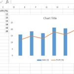
As soon as we select the first type of line graph, which is squared with red color in the above image, we will get the graph plotted as below:

Your line chart is created and placed on the Excel worksheet. You can now customize your chart as needed:
- Chart Title: You can add a title to your chart by clicking on the chart title area and typing a new title.
- Axis Titles: To add titles to the X-axis and Y-axis, select the chart, go to the "Chart Elements" button (the plus icon usually located on the top-right of the chart), and check the "Axis Titles" option.
- Legend: If you have multiple lines on the chart, you may want to add a legend. To do this, select the chart, go to the "Chart Elements" button, and check the "Legend" option.
- Data Labels: To add data labels (the values associated with the data points) to your chart, select the chart, go to the "Chart Elements" button, and check the "Data Labels" option.
- Formatting: You can format the chart, including line styles, colors, and markers, by right-clicking on the chart elements (lines, data points, etc.) and selecting the "Format" option.
Step 6: Save and Share
Once your line chart looks the way you want it, you can save your Excel file or share the chart in reports, presentations, or wherever it's needed.
Step 7: Interact with the Chart
When you click on the chart, Excel will display the "Chart Tools" contextual tab in the ribbon, allowing you to further customize the chart, change data sources, and perform other actions.
That's it! You've successfully created a line chart in Microsoft Excel to visualize your data trends over time. Excel provides a wide range of customization options, so you can tailor your chart to your specific needs.